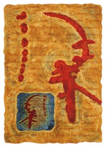
 Arborglyph: (1 symbol SAM) Samurai © 2006 Linda C. Everson From August 27 – Sept 19, 2010, one of my Arborglyph monoprints is in an international exhibit called StrassenKunst at Artspace Gallery in Richmond, VA. The theme of the exhibit is artwork INSPIRED by graffiti with 59 artworks chosen. There are photos of graffiti, paintings with graffiti images, jewelry and sculpture scratched with graffiti-like symbols, and so on.
Graffiti art isn’t just street art, nor is it always gang related. While graffiti today is often thought of as destructive and a form of vandalism, it has helped arhaeologists decipher interesting cultural practices and has brought history to a forefront.
The first graffiti art was created over 30,000 years ago at Lauscaux caves, and a few summers ago I visited that wonderful site. I have a penchant for cave art, rock art, petroglyphs, and pictograms, and those sites are inspiration for my Arborglyph monoprints. My graffiti inspiration is the from the markings on aspen tree bark in Colorado by humans, animals, or nature’s own scarring. In the American west, many trees were first engraved by the Basque and Hispanic shephards and the term Arborglyph (tree with a glyph) was born.
Apparently, the term “graffiti” came from the Italian term “graffiato” which means “scratched”. Graffiti generally means any writing on a public place, and it has been done over the centuries by the Greeks, Romans, Mayans, Vikings, and Celtics, to name a few. I was in Pompeii this summer, and the archaeologists had unearthed some interesting graffiti on walls there. In China, Mao Zedong was known for publicizing everything, including a 4000 character graffiti slogan on a wall. Throughout history man has yearned to “make a mark”.
Although their are many controversaries over some artists such as Bansky from England, graffiti has become more accepted in some fine art circles. Artists such as Keith Haring and Jean-Michael Basquiat did graffiti in subway stations and in the streets. Later they both became famous by showing in fine art galleries in the early 1980’s, and numerous videos were made of their lives and art. Interestingly, Basquiat in his early graffiti years left his “tag” SAMO in many places. The symbol I use in my art title in the StrassenKunst exhibit is SAM. I wouldn’t claim that I use “tags” in my artwork, but I do use symbols in the titles that are my own “alphabet”.
A “tag” is the most basic writing of an artist’s name, it is simply a handstyle. A graffiti writer’s tag is his or her personalized signature. Tagging is often the example given when opponents of graffiti refer to any acts of handstyle graffiti writing (it is by far the most common form of graffiti). Tags can contain subtle and sometimes cryptic messages, and might incorporate the artist’s crew initials or other letters.
Subsequently there are many graffiti INSPIRED artists and art exhibits today. I personally do not condone defacing public property with art. However, photographing graffiti art (on trees) has proven to be an interesting subject matter for me.
Tonight on Starz is the beginning of a 8 part mini-series based on Ken Follett’s novel, The Pillars of the Earth. This epic story deals with conflicting elements: building and destruction, love and war, good and evil, religion and royalty, family and foe, feast and famine, joy and misery, and so on. Although the fight for the crown in feudal England is a central theme, the evolution of building a massive Romanesque church to building a soaring Gothic cathedral in medieval 12th century England intrigued me more.
How does this story about architecture relate to me and my experiences in life? Like Tom the Builder and Jack, my father, grandfather and many uncles were builders. They built everything! Commercial buildings, houses, furniture, cabinets, outdoor sculptures, and extravagent bird houses. Building is part of my roots!
In college, I had to take art history classes where I studied Romanesque churches, Gothic cathedrals, flying buttresses, cornices, naves, and so on. At the time I found it a bit mundane. Since then I’ve been fortunate to travel to Europe, and now find that those classes were very valuable when visiting various architectural sites. As I read the novel, I found myself intrigued by all the building practices of the time.
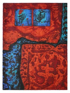
 Although I’m not a builder, I now have a penchant for photographing ancient walls. While in Andalusia, Spain, I toured lots of Moorish architecture and photographed the walls and crumbling arabesque ornamentation. Those images were used as background textures in my Arborglyph and Arabesque monoprint series. I worked on this series for an exhibit in Kuwait in 2007. Although I’m not a builder, I now have a penchant for photographing ancient walls. While in Andalusia, Spain, I toured lots of Moorish architecture and photographed the walls and crumbling arabesque ornamentation. Those images were used as background textures in my Arborglyph and Arabesque monoprint series. I worked on this series for an exhibit in Kuwait in 2007.
Calligraphy is an important art form there. My Arborglyphs (calligraphy-like glyphs that have NO particular meaning) provide a visual link between cultures.
Arborglyphs and Arabesque: (2 symbols 1, 3) Ancient Rust Walls
© 2007 Linda C. Everson, All Right Reserved.
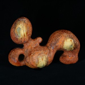
Tonight is the opening reception for the exhibit Moore Inspired at the Botanic Gardens in Denver. My ceramic sculpture Reclining Mother was accepted into this juried exhibit through August 1, which displays Colorado artists whose works were inspired by Henry Moore.
 © 1968 Linda C. Everson Henry Moore’s wonderful sculptures are on display in the Botanic Gardens until January 31, 2010.
Henry Moore’s use of organic forms in his Reclining Figures influenced my creation of Reclining Mother while doing ceramics in college. I was attracted to the primitive and archaic attributes in his forms and surface. Although my sculpture is ceramic, my earthy and reticulating glazes were influenced by Moore’s use of surface on wood and rock.
The ‘hollow’ or negative spaces in Henry Moore’s figures were significant in my own sculpture as well. These enclosures lead the eye back into the embryonic figure. Although reclining, my ceramic figure has movement. My sculpture is small in comparison to Moore’s monumental figures, but it still is a non-representational ‘mother earth’. Moore’s sculptures were tied to the earth as well.
See more information on Henry Moore lectures and tours at the Botanic Gardens.
Today, April 22, 2010 – 40th anniversary of Earth Day! I personally pay homage to Mother Earth by using nature in my artwork in an abstract manner. When I hike or travel, my camera is a constant companion and I take photos of nature and ancient architecture that I use in my monoprints.
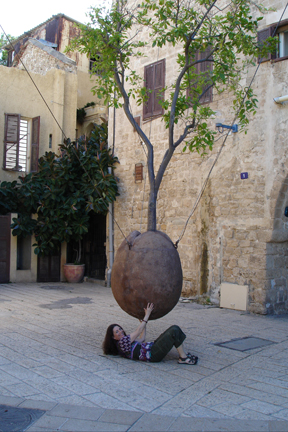
I was traveling in Israel recently and couldn’t resist a photo of myself with the lovely hanging tree in the art quarters of Old Jaffa. This hanging tree could have many interpretations and is quite an inspiration. Margaret Mead said in 1978
“EARTH DAY is the first holy day which transcends all national borders, yet preserves all geographical integrities, spans mountains and oceans and time belts, and yet brings people all over the world into one resonating accord…

Respecting Mother Earth “rests in all our hands”.
The Embrace show at the Denver Art Museum was one of the more extensive and interesting installation shows I’ve seen. Seventeen artists created their own ‘dialogues’ with the unusual architecture in various areas of the museum. Although ‘painting’ was a term often used to describe the art; the installations encompassed everything from plastic, cloth, wood, mirrors, found art, sculpture, video, and so on.
In addition to the interplay of the art and architecture, the use of language, interesting materials, and the interaction of the audience in the artwork were also important components of the Embrace exhibit.
El Anatsui’s Rain Has No Father? was a huge ‘cloth’ made of found bottle tops that were sewn together with copper wire. It was displayed in the African Art area where you observed other ancient African art in it’s proximity, seeing a common link between the traditional and the contemporary. His analogies to the Rocky Mountains and raindrops in shimmering clouds was remarkable. DAM is well known for it’s Native American collection and the art reminded me of Native American blankets and clothing as well. The flowing nature of Anatsui’s ‘cloth’ negated the actual stiffness of the metal components, and I admired the sheer amount of work involved in creating his ‘cloth’. Although his art did not have the same use of the diagonal wall spaces that was so obvious in other installations, the shadows created on the wall behind the ‘cloth’ were beautiful.
In Chamber, Charles Sandison used the diagonal walls and ceiling of a cavernous space for his video projections of swirling colors, letters, words, and symbols. Language was an important component. What I enjoyed about Sandison’s installation was that the viewers were also part of the artwork. Their bodies created shadows on the walls, so they were also ‘creators’. The images swirling on their bodies and clothing made them into mini artpieces walking throughout the space. The art repeated itself, yet it was constantly changing. It was a wonderful experience!
Another artist who’s art involved the audience through the use of mirror’s was Zhong Biao. In Mirage his combination of abstraction and different sized figures at different perspectives and angles added complexity to his huge painting.
In Twilight’s Compendium, Shinique Smith’s installation was probably the smallest in size. Yet her “binding and bundling” of found materials (usually fabrics) that were “unwanted, abandoned, coveted, and mass-produced” was an intriguing environmental comment on multiple levels. Many years ago I did a lot of sewing and also worked in the fashion industry, so her materials were reminscent of past experiences for me. Shinique Smith’s artwork is autobiographical, and tells stories not only about herself, but others as well. Again, language is a important component of her artwork.
Christian Hahn’s art did not relate to the architectural space of the building so much, but his use of space within his paintings was quite intriguing. His uniformed figures within unusual environments were prettily colored, yet somewhat scary and hazardous. The scenarios created conflicting emotions of “playfulness and aggression”. There were countless stories and possible lessons to be learned from Hahn’s art.
The walk up and down the stairways of DAM gave me multiple perspectives and created questions on several of the installations. Did I like the spray painted art of Katharina Grosse better from above or below? Where did that cord on the Jessica Stockholder’s plastic art on the staircase wall lead to? Was it interesting to view one installation through another installation? Would John McEnroe’s drippy art fall? Would I get cut by Matthew Brannon’s humungous knives? Why did the children love the bungie cord installation by Tobias Rehberger, but I got claustrophic? How did his interpretation of ‘rain’ compare to Anatusi’s ‘rain’? Did Rick Dula’s painting of the skeleton of the Hamilton building emphasis the complexity of the buildings structure?
Embrace was a wonderful exhibit at DAM and if you missed it, you can learn a lot from the 2 volume catalogue. There are many photos of the artists in the process of creating those extremely intriguing installations. The engineering feats alone were substantial. I find that as an artist, I learn so much from other artist’s comments, processes, and artworks.
When the Denver Art Museum (DAM) opened its new expansion, the Frederic C. Hamilton Building which was designed by Daniel Libeskind; art critics and some viewers complained about the unusual contemporary design. A common complaint of Libeskind’s architecture was that the slanted walls made it difficult to show lots of artwork.
However, the current show Embrace proved them wrong! Seventeen contemporary installation artists were invited to work with this unusual architectural space and it was a huge success in my opinion. The wonderful staircase and atrium in DAM gives the opportunity for the viewers to see several of the installations multiple times in different perspectives, and to see connections between the installations.
The Embrace show is about the dialogue between painting (in a broad scope) and the architecture. In the Embrace catalogue, Christoph Heinrich’s talks about the labyrinthine space, cavern qualities, mazes, and diagonal walls in the Hamilton Building at DAM.
Even in the very beginnings of art, cave painting responded to the shape of stone…with the bison… deriving their volume from the natural projections of the walls on which they were painted.
I found this to be an interesting analogy, having toured many of the ancient cave sites in Europe. Henrich’s discussion about the traditional “white cube” type of museum and the new role of the general public in art appreciation is very interesting. I highly recommend this Embrace catalogue to further understand museums, viewer’s roles, installation art and the artist’s concepts and process. The catalogue has so many great photos of the artists at work, plus their final installations, that you don’t have to see the actual show to learn from it. Unfortunately the show closes April 4, 2010, but the catalogue will still be available.
A French artist born in 1925 whose paintings and etchings I admire is James Coignard. He dealt with extremely tactile surfaces and the use of some graffiti. The structure of his 1980’s paintings in which he used squares or rectangles to draw the viewer into the artwork had much influence on the structure of my own monoprints.
My Arborglyph images are also ‘squares’ laid upon a background surface and they tend to float on the surface of the print. Many people have commented that the Arborglyph squares in my monoprints look 3-dimensional, or like floating windows. The window effect is very significant in James Coignard’s paintings and prints as well.
Coignard was coined for doing carborundum etchings, as was Antonio Tapies, Pierre Marie Brisson, and Miro. Carborundum etching was ‘invented’ by Goetz in the 1960’s. It’s a process where silicon carbide (an abrasive grit). is applied to printing plates to create tone and dense areas of black . It actually is the ‘reverse of etching’, because it builds UP the plate instead of the plate being incised. The process can create a very textural quality.
I was recently interviewed on www.blogtalkradio.com/annette-coleman in the Artist name names, what artists inspire their work episode. Coignard and Antonio Tapies were two favorite artists I mentioned.
Artists are often asked what other artists inspire them. Yesterday I was interviewed on www.blogtalkradio.com/annette-coleman in the Artist name names, what artists inspire their work episode. I thought I’d share my thoughts about inspiration in my blog also.
One of my favorite art books is The Language of Antonio Tapies: Surface and Symbol. Both surface (texture) and symbols are a major element of my artwork as well. Antonio Tapies is a Spanish artist who does prints, mixed media paintings, assemblage and sculpture. In the 1950’s he did Matter Paintings in which he used sand, dust, and other materials that suggested fossils, cracks, and fissures. Matiere painting refers to use of texture. Tapies also often used letters, graffiti, and calligraphy- like symbols in his artwork, possibly because he came from a family of bookmakers. In my Arborglyphs series of monoprints, I also use calligraphy-like symbols. Tapies once said, “Art is not decorative, it is a philosophical system or language that contains a total vision of the world”. I like his use of the word “language”. Although my Arborglyph symbols have no specific meaning, they often ‘seem’ to evoke a memory of something in the viewer’s eyes.
I was also inspired by a video about him at the Tapies Foundacio in
Barcelona, Spain. Tapies was filmed walking in his garden, home, alleys and pathways, where he observed what he called “glimpses” of the fairly mundane things. Texture on the cobblestone, scratches on an ancient door, shadows in the garden, or flickering light across a rugged wall. All these so called unimportant close-ups of the world played an important role in his abstract imagery, and I also make the same close-up observations of nature.
If you look at his artwork and at mine, your would probably not see many similarites, yet our visions are fairly similar. We both like surface and texture, both make use of symbols and language in an abstract manner.
Water on the moon! The quote below makes it almost sound like a piece of art:
The water findings came through an analysis of the slight shifts in color after the impact, showing telltale signs of water molecules that had absorbed specific wavelengths of light.
The moon is so intriguing, but humans will not visit it again until after 2020. So far only 12 men have walked on the moon. Interestingly, there was this communication between Houston and the Apollo crew:
Watch for a lovely girl with a big rabbit. An ancient legend says a beautiful Chinese girl called Chang-o has been living there (on the moon) for 4000 years. It seems she was banished to the moon because she stole the pill for immortality from her husband.
Meanwhile, we can dream and ponder the mystery of the moons in our artwork. While the reality of science is important, the Man in the Moon still holds some fascination. The waxing and waning of the moon in appearance makes room for multiple interpretations. Psychologically, pareidolia is term used for seeing vague/random things in something as significant (ie… images in the moon).
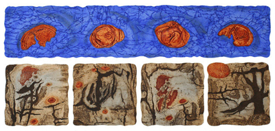
In our Solar System, the number of moons seem to vary from 146 – 170, with Jupiter having the most (approximately 63). One of my Arborglyph monoprints alludes to FOUR MOONS. In this monoprint I inked / printed 4 ‘found’ metal surfaces (collagraph plates) that vaguely resembled “faces” or “phases of the moon”.

Arborglyphs: (4 symbols 1 2 3 4) Four Moons Rising
© 2002 Linda C. Everson, All Rights Reserved.
I just saw a wonderful exhibit – Women’s Work: Contemporary Women Printmakers from the collection of Jordan Schnitzer and his family foundation at IDEA Space, Colorado College in Colorado Springs. The exhibit included 56 /5000 prints from the collection.
LAYERING was a common theme in many of my favorite prints in the show.
I loved Helen Frankenthaller’s huge abstract woodcut, Madame Butterfly (2000), with 46 woodblocks used to create the artwork. Although she’s more known for her color field paintings, I love Frankenthaller’s woodcuts even more. Similar to her fluid transparent use of paint with canvas showing through; in this woodcut, transparent inks reveal the surface texture of the woodblocks underneath. She used her ‘guzzying’ technique, which involved using dental tools and sandpaper to raise the texture of the wood for better printing. Lovely layering!
In Sherrie Wolf’s Artemisia Suite prints, still life fruit images were layered on top of old copies of Artemisia Gentileschi’s 17th century paintings of women. Her oppositional use of old and new artwork, and the swirling figures versus the static fruit was intriguing. Sherrie Wolf commented on her artwork,
“Art stretches us by being several things at once. It can be a ripe fruit ready to fall off the canvas onto the floor, but also, when viewed up close a collection of brushstrokes on a flat surface.”
As a photographer/printmaker, I liked Hung Liu’s lithographs that were based on old Chinese photos. “My prints are metaphors for memory and history.” she said. The photos became more subjective and reinterpreted with her painterly style of Abstract Expressionism. Also, the layering of landscape imagery such as wildflowers and birds in Hung Liu’s added another dimension of symbolism of Chinese women. Ironically, in China everything had to be “official“, and hence Liu “broke the rules” in her Unofficial Portrait series. Her past history of the Cultural Revolution, her art training in dogmatic China, and her present status as an American art professor, show the dual nature of her images and style. The layering of multiple themes of womenhood, culture, and aesthetics are implicit in her “portraits”. “Printmaking is about layers”, Hung Liu explains on page 5 of Painterly Proofs: Prints by Hung Liu.
It was great to see an exhibit of some of our best contemporary women printmakers! What I thoroughly enjoyed was that the artists used many conventional printing methods in a contemporary manner, and there weren’t any monotypes in the show.
|
|
